The business world has undergone a massive change in the last decade, with more and more consumers who live increasingly mobile-centric lives. Consumers can now do just about anything from a mobile device, from making appointments, answering emails, doing this week’s grocery run, setting reminders, doing research, and checking in on social media. These days, it is just not enough to have an excellent website with a modern design. It is also imperative in today’s mobile-centric society to be able to appeal to your users on multiple platforms. And really, the small screen has become king. Big screen appeal is declining. This means making some changes to our approach to mobile web design.
How Google’s Changes Affect You
Google noticed that the majority of their users had shifted from desktop or laptop searching to searching from their phones or tablets on the go, and they changed their mobile indexing algorithm to match. Google now gives preference to mobile-friendly sites, by analyzing site data using things like Bounce Rate (how quickly users click out of your page), mobile-specific SEO, etc. etc.
The problem is, business websites are being indexed lower in search engines due to this shift in Google’s mobile indexing algorithm. Google very much wants to send their users to websites that they actually will enjoy using. If Google were to send visitors to sites that frustrated them for one reason or another, their users would likely move elsewhere. Therefore, you want to make sure Google sees your site as having a mobile-friendly web design, given that most of Google’s users now use their services from mobile devices.
Why Does This Matter to Your Business?
If your website is not mobile friendly in the eyes of Google, you could be losing out on traffic. This translates to losing out on business drummed up from online. With just a few tweaks to your mobile web design and learning some basic SEO, you could increase your chances of garnering online business.
Here’s how to get started:
Web Design with Mobile in Mind
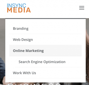
Design for Finger-tap Navigation
One effective (and easy) way to make your business’ website phone or tablet friendly is to make sure as you design your website that your practical design choices play well on a small screen. For example, a collapsible menu plays better than a sidebar menu that can get in the way of a scrollbar. Make sure any links or buttons are big enough to be finger-tap clicked. Also, popups are incredibly annoying for a phone user who has a hard time getting rid of them on a smaller screen. Even responsive popups that adjust to different screen sizes are very annoying on small phone screens. Getting rid of popups alone can help improve your mobile user bounce rate, as many users who can’t catch that little “x” with their finger on the small screen will just back out of your site and go elsewhere.
Avoid Flash
Another way to optimize your website for phone/tablet users is to avoid using Flash. If your end users don’t all have that plugin installed on their phones and tablets, then your website won’t load correctly, leaving images missing, or error notices. This is not the user experience you want your visitors to have! These users will likely bail back to the search results, and go elsewhere, increasing your bounce rate.
Responsive Web Design Vs. Separate URL
Some sites choose to have separate sites for phone/tablet versus desktop views. This means when your website is viewed from a small-screened device, it automatically redirects to a separate mobile-friendly URL, identical to your original website informationally, but designed specifically for smaller screens. While Google supports this, they prefer a responsive site design. This means the site is loaded from the same URL, but the layout changes and simplifies slightly according to the size and type of the screen being used (measured in pixels).
To see how mobile-friendly your site is in the eyes of Google, you can run a check here (https://search.google.com/test/mobile-friendly)

Boost Your Page Speed
One of the biggest things that Google watches for is site speed, also called page speed. This is simply the time it takes your website or page to load on the varying screen sizes. Aside from being inconvenient to your end user, if your site is bogged down and doesn’t load quickly on a small screen, it can also mean that Google’s mobile-first indexing will demote you.
Reduce File Sizes
The biggest reason for a slow-loading website is bloated files. If you have code files or image files that are too large, they will take a long time to load, especially on a small-screened device. This can be solved by compressing image files into smaller file sizes before uploading them to your page. This is a little more advanced, but you can also do what is called “minifying” of your coding files. This just means removing anything unnecessary from your coding files, such as spaces and extra lines or commas. Alternatively, you can compress the whole file. Most of the time, however, just compressing any image, video, or audio files alone will make a difference.
Avoid Redirects Where Possible
Another thing to be aware of is redirects within your website. The more times your website automatically redirects to another page, the longer the loading time. Earlier we mentioned that some websites would have a separate, mobile-friendly URL that users are redirected to if they search for your site on a phone or tablet. This is the reason that Google prefers responsive web design approach, rather than this separate URL approach to mobile web design. A redirect to a mobile-friendly page automatically slows your load times, something most search engines frown upon.

Anticipate Your User’s Needs
One way you can appeal to mobile consumers is to add certain things to your mobile-friendly pages that go above and beyond. For example, if your business has a brick and mortar local element, why not tag your website with your location? This can help boost your search rankings for phone and tablet searches from within your geographical area.
Contact Information on Mobile
Another way you can help is to anticipate your mobile user’s needs. Think about it, when you search for a business on your phone, there is a good chance you are looking for contact information, right? You can anticipate this need by making sure your “contact us” information is easy to find on the phone version of your homepage. This can be accomplished best in one of two ways: by adding a contact page right to your mobile-friendly menu or having it displayed on your homepage. Consumers who search from their phones expect this information to be more accessible via phone than on a desktop display (which usually is a small link down in the footer of your site, very hard to catch with your finger).
What Are They Looking For?
Ask yourself, what will my target customers who encounter my page on their phones be looking for? Will they likely go to your site to make purchases? Maybe make a product search bar easy to find. Are they looking to schedule an appointment? Make sure your scheduling modules are mobile-friendly and easy to find from your mobile-friendly site. If you are successful at anticipating the reason for your user’s visit from a mobile device, you will be able to answer those needs directly, vastly improving your mobile user experience. This also helps improve your bounce rate, as they will find what they are looking for without too much clicking around.
Responsive web design is so essential in today’s world and is only growing more and more standard in the business world. This is not going away any time soon. Responsive web design can make all the difference in your ability to connect with your target consumer, and their ability to engage with your business. This is the basis for effective online marketing, and it begins with the design of your website.
