What’s Involved in an Effective Web Design?
Designing a website involves much more than just creating an aesthetically pleasing appearance. Instead, web design focuses on an overall user experience. This includes not just the look of the website, but also how it works and how easy it is for users to read through and interact with your site.
When designing a website, web designers look at the site’s layout, branding, interactive features, and responsiveness.
Why is Web Design Important?
A bad web design is one of the top reasons why users leave your site within mere moments of viewing. If the design isn’t pleasing to the eye, responsive on their device, or has a poor user experience, the viewer will be gone before they can even get to know you as a business.
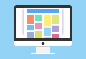
The Website Layout
Any design should take into consideration the structure and layout of not only individual pages, but also the entire website as a whole.
Web pages should flow well so your audience doesn’t get lost in your content. When a page is choppy or doesn’t flow well, there is a higher chance the viewer will get frustrated and leave your site.
While the structure of each individual page is important, so is the structure of the entire website. This is called a site map. Site maps are organized lists of pages that exist on a site. When in the planning phase, they include general information will be present on that page on wireframes. However, in general, site maps can be found in the footer of a web page.
An effective site map helps viewers navigate your website. If the viewer can’t find the page they need to visit because the site map is messy and confusing, they will leave before they can consider using your products or services.
Consistent Branding
Your site needs to match your business’s branding. This includes colors, fonts, imagery and the general tone of your site. When your branding is consistent with your website, you become further established as a business in the eyes of a viewer. They know who you are because your branding is so distinct.
Stay consistent with your brand and you will build authenticity and recognition as a business.

Using Interactive Features
An effective web design often involves interactive features. These elements could include something as simple as a button, link, contact form or call to action. However, some businesses and designers opt for more unique features like galleries, sliders, or hover effects. The most important aspect of any of these features is that they work for the users on any device.
As long as you make sure these features are in working order on all devices, interactive elements can keep viewers interested regarding your website and business.
A Responsive Design
Why is a responsive design important?
Ensuring your website’s design is responsive is incredibly important to the user experience. People are using mobile devices more and more to do just about everything, from making appointments, answering emails, to scrolling through your website. When the layout of a web page isn’t responsive on whatever device a viewer is using, it will become frustrating for the user to navigate and use your website. They will leave and look for another more responsive website elsewhere.
It isn’t enough to simply have a modern, responsive website that’s only responsive on bigger screens. It’s also necessary to appeal to the users coming in from multiple different mobile platforms by having a mobile responsive design.
Making Your Design Responsive
- Make sure interactive features are working. Features such as links and buttons can sometimes have issues when your website’s design is converted to mobile. However, the biggest issue often arises when your site has special or unique features designed for desktop interaction rather than mobile interaction. Make sure hover effects, sliders, moving charts, or other features work as they should on all mobile versions.
- Design for finger-tap navigation. Ensuring effective finger-tap navigation involves checking to make sure buttons, links, and menus are big enough to be tap-clicked on. If your website has pop ups, confirm that the “x” is big enough that users can tap out of the pop up. Finally, menus on mobile devices often work best when they are collapsable. This way, viewers can effectively read all the information on your page as well as easily navigate to other pages.
- Have easy-to-find contact information. When people come to your business’s website, they are often looking for a quick way to contact you. Make sure your contact information is at the ready and that any interactive buttons or forms are working properly on smaller screened devices.
Affecting Search Results
Google and other search engines know that users are using their search services more and more often on mobile devices. Because of this, Google gives preference to sites that are mobile-friendly in terms of ranking.
When a website with a poor design is causing users to leave almost as soon as they arrive (this is known as a bounce rate – when users visit your site then leave almost immediately), Google and other search engines will know and rank you lower in search results. Lower rankings mean less traffic which means less business.
You want to ensure Google and other search engines see your website as one with a mobile-friendly web design. With just a few tweaks to responsiveness and SEO, you could increase your business’s online traffic.